Choosing a Color Scheme
Creating the Right Color Scheme
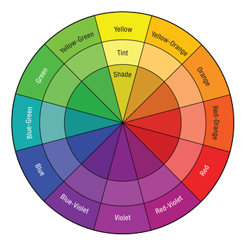
The color wheel is the basic tool in creating color schemes and one of the most powerful decorating tools available, once you know how to use it. Within this colorful circle are helpful color cues and color relationships that can help you build a harmonious color scheme. These 12 colors are divided into three categories: primary, secondary and tertiary, as well as shades and tints.
Primary Colors
Red, blue and yellow. An ideal choice for rooms that come off feeling strong and solid. Each is a pure color that can't be created by mixing other hues.
Secondary Colors
Green, orange and purple. They are created by mixing two primaries in equal amounts. Like all colors, each secondary hue can be tinted with white or shaded with black for variations.
Tertiary Colors
Red-orange, red-purple, blue-green, blue-purple, yellow-green & yellow-orange. Tertiary colors exist through mixing together equal amounts of a primary and a secondary color that falls beside it on the color wheel. You can combine these colors for a sophisticated look.
Monochromatic
Using a subtle variation of a single color's intensity (for example, orange, coral, and peach) can offer variety within the same family.
Cool Versus Hot
Look at the colour wheel and you will see the left hand side of the colors are 'cool' or 'cold' and the ones on the right are 'warm' or 'hot'. Warm colors appear as if they are advancing toward you which tends to make your space cosier. Cool colors appear to recede, as though the space is expanding.
Harmonious Colors
Harmonious colors sit next to another on the color wheel. It's very easy to create a balanced, unified scheme that is pleasing to the eye using harmonious colors because they share a common color or hue.
Complementary Colors
Complementary colors are ones that are opposite to one another on the color wheel. These colors are naturally made to 'go' with one another - think of the red and green of an apple, or the purple and yellow of an iris. They tend to be bolder and more dramatic than harmonious schemes.